Helen Hamlyn Centre for Design, Royal College of Art
Helen Hamlyn Centre Data Platform
A research repository that anyone can explore, with a mouse, a keyboard or on a phone.
- Role
- Research Assistant
- Data collection and analysis with the team
- Data modelling, design and build on my own
- Outcome
- Live and in use. Used to teach the Centre's summer interns. First-author paper on its accessibility approach accepted at DRS 2026.
What this shows
- Accessibility
- End to end
- Data visualisation
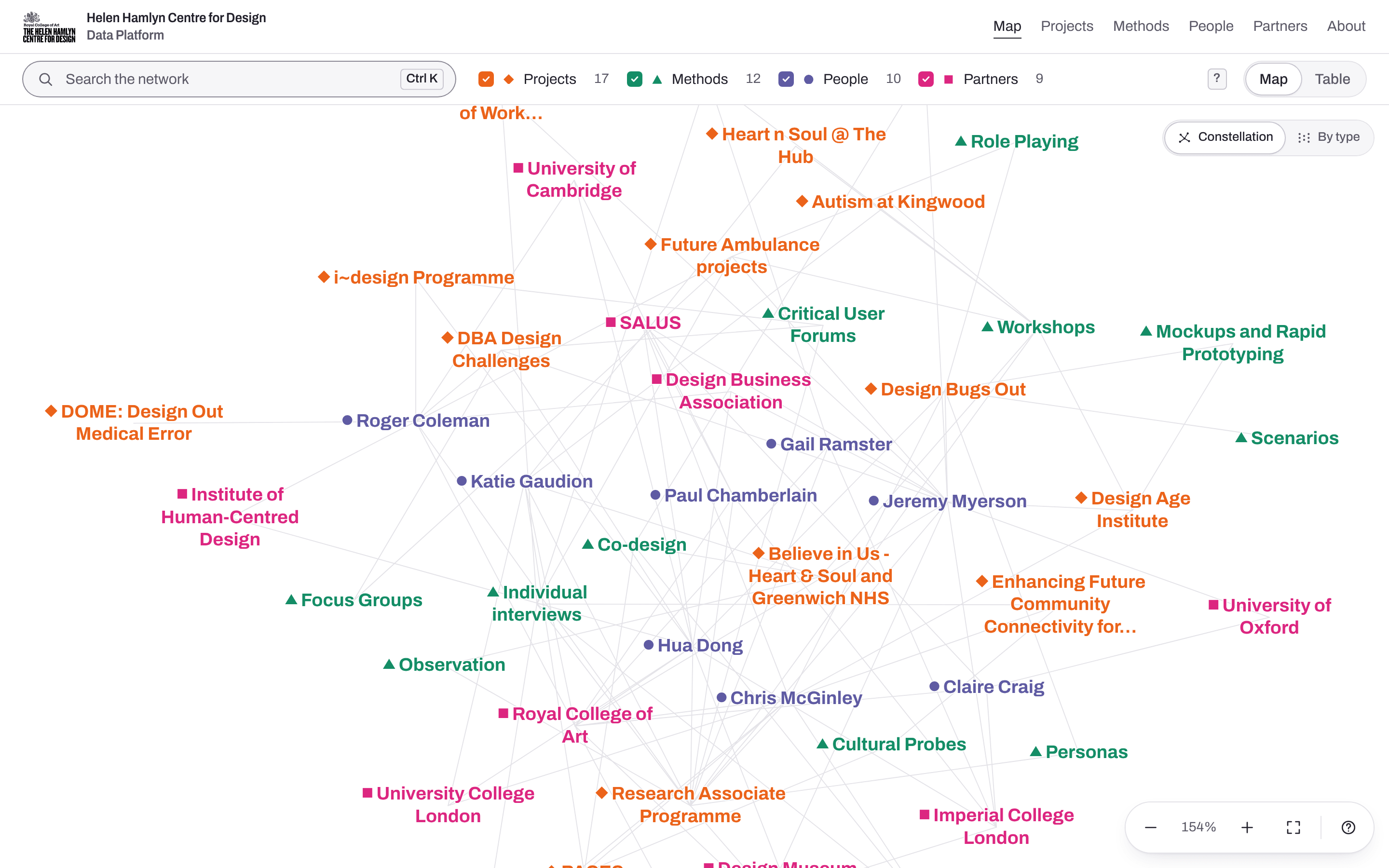
The map today
- Projects
- Methods
- People
- Partners
Part 1: VOICE, the first version
Audience and accessibility · From map to network · First prototype · Stakeholder workshop · Data collection · Dual view
Accessibility as the starting point
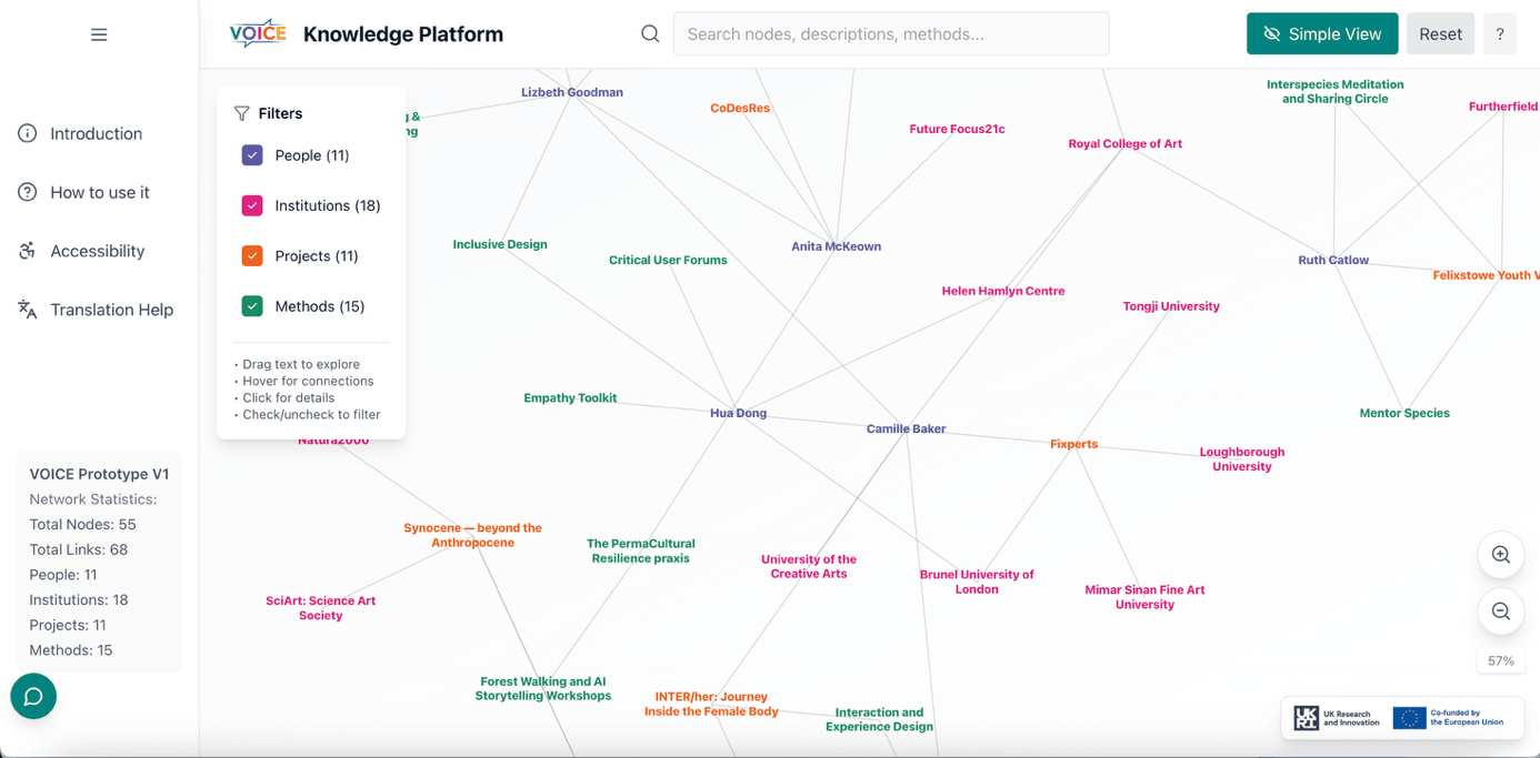
VOICE was an EU-funded arts research project, run by seven organisations in several countries. I worked on it as a research assistant at Brunel University. Its audience was broad: artists, researchers, community groups and policy makers. With an audience that broad, accessibility had to be part of the platform from the start.
A network instead of a geographic map
VOICE wanted to show its communities and projects together, as one connected body of work. Because the project spanned several countries, we started with the obvious approach: a geographic map. But VOICE was built around communities, and a community is held together by shared projects, methods and partners, not by borders. So we moved to a network with no hierarchy – a rhizomatic map – where people, projects, partners and methods connect directly, as equals.
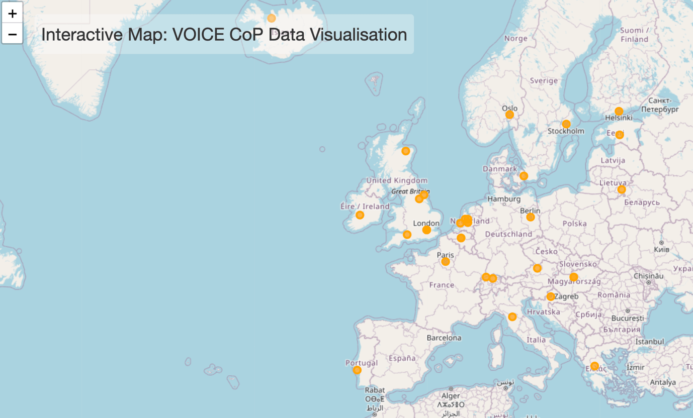
Prototype A
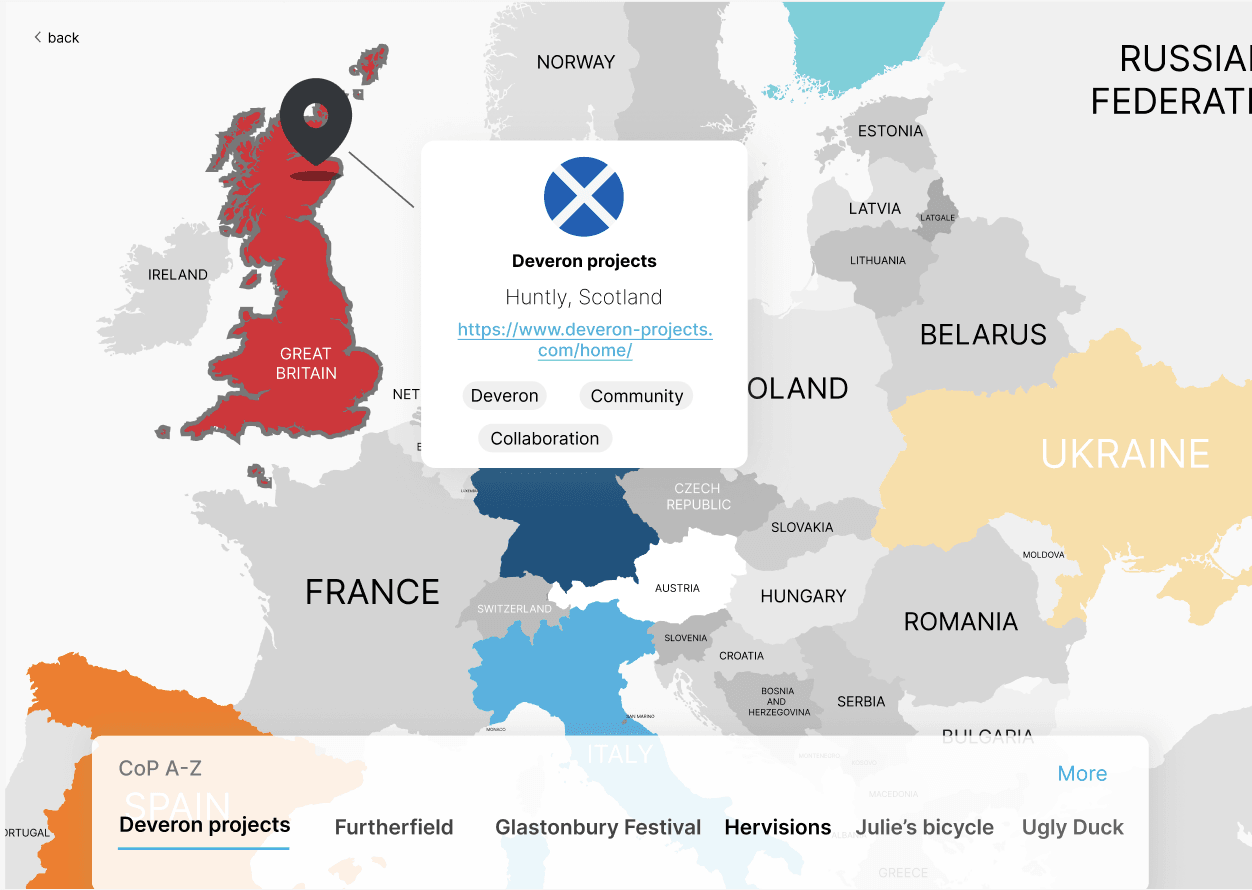
Prototype B
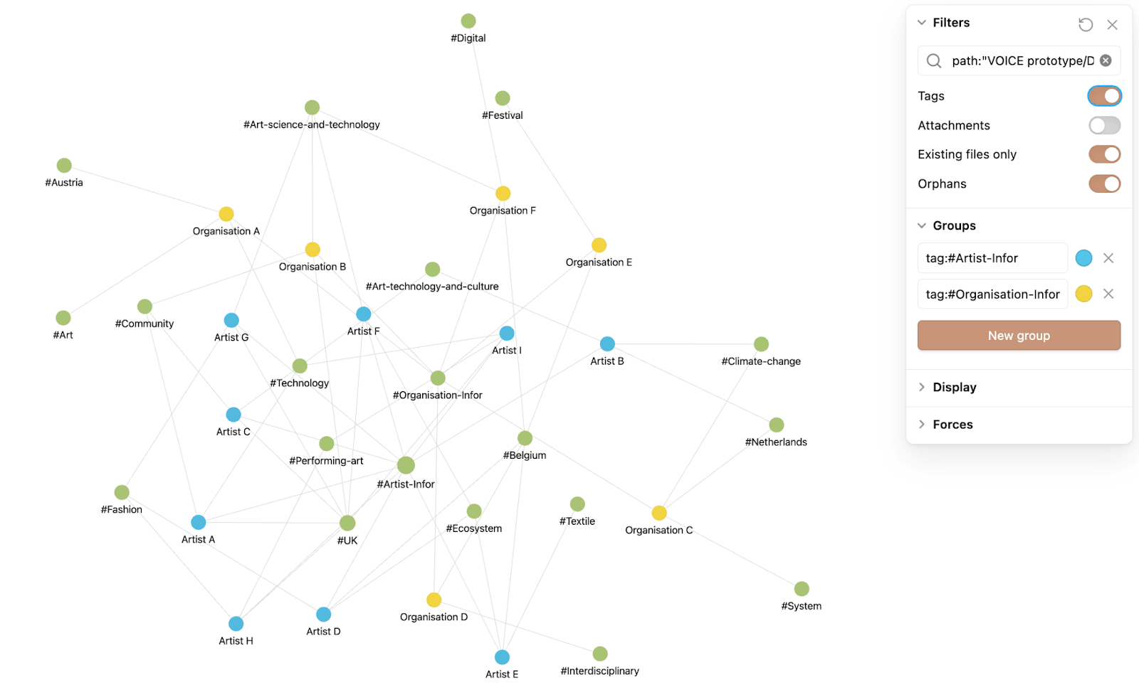
A first prototype in Obsidian's graph view
To test the network idea quickly, I built a first prototype in Obsidian's graph view, with sample entries linked by shared tags. People could explore a network before any real data existed, and the workshop started from these prototypes.
A 75-minute workshop: 14 participants, seven stakeholder roles
I designed the workshop around the data the platform needed, and led it with a fellow researcher. Fourteen members of all seven organisations took part. Working in pairs, each pair took a stakeholder card, from eco-social artist to EU cluster coordinator, and judged the prototypes from that person's point of view.
The Local Councillor wants to work with an artist to encourage local people to get involved in a consultation on a new plan for a public transport network.
Wall 1
Content
Every type got a consistent structure, and methods were linked to the projects and people that used them.
Wall 2
Scope
Entries should touch at least two of three themes: technology, community and environment. The scope went beyond Europe.
Wall 3
Functionality
Filters, search and visible connections ranked highest. Translation scored low, but participants argued it was essential for inclusion, so we kept it.
Data collection is part of the design
On the map, people, projects, methods and partners carry equal weight. Collecting them called for a different logic. Asked to fill in four separate types, people would struggle to know where their work belonged, so the survey starts from the person: who they are, what they worked on, which methods they used and who supported it. Each answer maps to one type, so splitting the rows into four linked types was planned before the first answer came in.
Step 1 of 5: Decide what the platform needs to know. The four types, each turned into a question: people, who are you; projects, what did you work on; methods, which methods did you use; partners, who supported it.
A dual view: the network and a list
A network graph is hard to use by keyboard or with a screen reader. So, with accessibility in mind, we chose a dual view, which the workshop also called for: the same entries as a list in four columns, with the same search and filters. Ctrl + E switches between the two.
Network
- Keyboard: hard to use
- Screen reader: hard to use
- Mouse: works
List
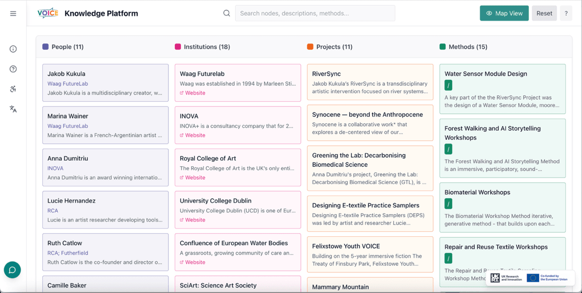
- Keyboard: works
- Screen reader: works
- Mouse: works
Part 2: Helen Hamlyn Centre
The Centre's version · Two arrangements · Onboarding · Keyboard navigation · Responsive design · Colour contrast · Testing · Takeaway
Taken up by the Helen Hamlyn Centre
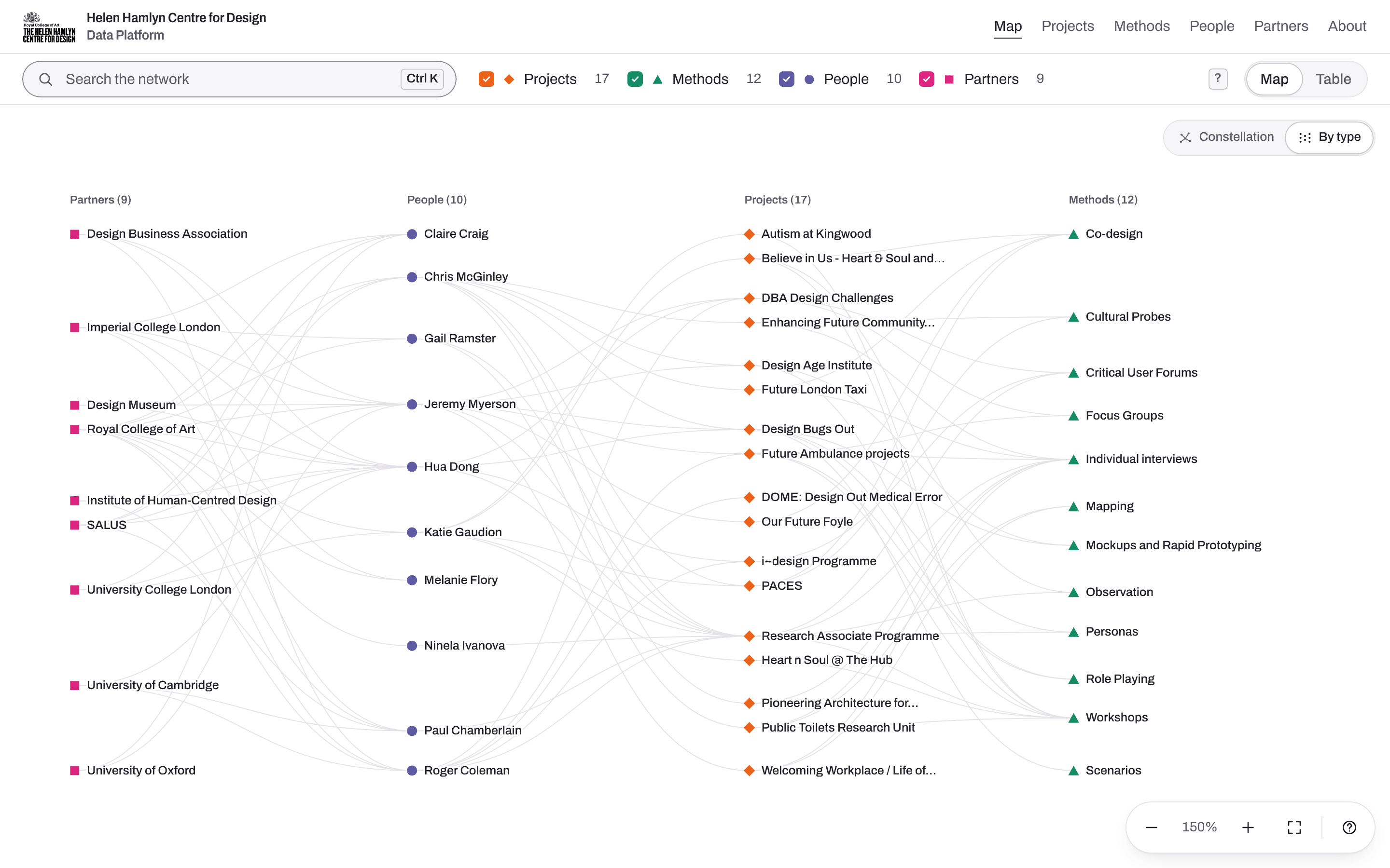
VOICE soft-launched in September 2025. The Centre brought its own research data and fixed brand colours, and I rebuilt the platform for it in Next.js and TypeScript, so the data model is typed end to end and the platform is easier to maintain and extend.
- 17Projects
- 12Methods
- 10People
- 9Partners
- 104Connections
Two arrangements of the same map
The map opens as a free network, with every entry the same size. One switch moves the same entries into four columns by type, which are easier to scan and to follow by keyboard. Both layouts are calculated in advance, so the switch is a single animated move. A list view of the same entries sits alongside both, for screen readers and anyone who would rather read than explore.
Onboarding inside the map
On a first visit, one project pulses, and four short cards walk you through the map: open it, follow a connection, step back, switch arrangement. Each card waits until you've done what it asks, can be skipped and never moves the keyboard focus. It all works by keyboard alone.
Accessibility – keyboard navigation
The map is a single stop in the tab order. Arrow keys move to the nearest entry in that direction, in either arrangement, and the view pans to keep it in sight. Each entry is announced with its name, type and number of connections, shown on screen in this recording.
- Tab
- ←
- ↑
- →
- ↓
- Enter
- Esc
Responsive design
On a phone, details open as a sheet over the lower part of the map, and the selected entry pans into view above it. The map opens at a readable zoom, and its controls have 40px touch targets. Nothing scrolls sideways, down to 320px.
Accessibility – colour contrast
The Centre's brand colours are fixed, and two of them fail contrast as small text. Map names keep the original colours, set bold and large enough to pass; zoomed out, they switch to darker variants. A script reads the real CSS and checks all 27 colour pairings. Each type also has its own shape, so colour is never the only cue.
Accessibility – testing
Automated checks gave VOICE a near-perfect score, but missed that entries on its map couldn't be reached by keyboard; only the list view made them reachable. In the Centre's version, every entry on the map can be reached by keyboard, and axe found no issues at desktop and phone widths. It was tested in Chrome, Safari and Firefox, and with the VoiceOver screen reader.
VOICE
- 99Lighthouse accessibility score
- 0WAVE errors
- Missed: entries on the map couldn't be reached by keyboard
Centre's version
- 0axe violations at 1440 and 390px
- Every map entry reachable by keyboard
- Tested in Chrome, Safari and Firefox
- Tested with the VoiceOver screen reader
One person, two points of view
Accessibility was part of the data model from day one.
I helped collect the data, then designed and built the platform myself. Working as both designer and developer, I could plan accessibility into the data and the layout from the start: the list view, keyboard navigation and both arrangements all run on the same data.
- Context
- VOICE at Brunel University, then the Helen Hamlyn Centre, RCA.