Logistics infrastructure company
One Design System,
Three Products,
Any Brand
Started in Figma, shipped as code, and layered so anyone can restyle it without breaking contrast.
- Role
- Design Engineer
- Figma library, colour scales and code on my own
- Outcome
- One design system across the company's products, which every client and user can customise on top.
What this shows
- Design system
- Figma to code
- Accessibility in the colours
Part 1: One system for every product and client
Drifting apart · Custom branding · A four-level solution
Three products from one company, drifting apart
The company began with one product and its own colours and design tokens. New products took only those first tokens with them, and each needed things the first didn't have.
Built fast by different teams, much of it with AI coding tools, each product changed or dropped what didn't fit. With every release they looked less alike.
Every client wants its own look
Even within one product, our customers are companies with brands of their own, and each wants it to feel like theirs: their colour, their typeface, the shape of their buttons.
Each level overrides only what it needs
I split the system into levels. The shared package is the foundation: it sets every colour, role and component and runs through everything, so a fix there reaches all three products. What only one product needs sits in the second level, built from existing tokens rather than new colours.
Within one product, each client sets its own colour, font and button shape for all its users, and each user can adjust their own look again as they need.
Part 2: From Figma to code
A Figma library · Kept in code
It started as a Figma library
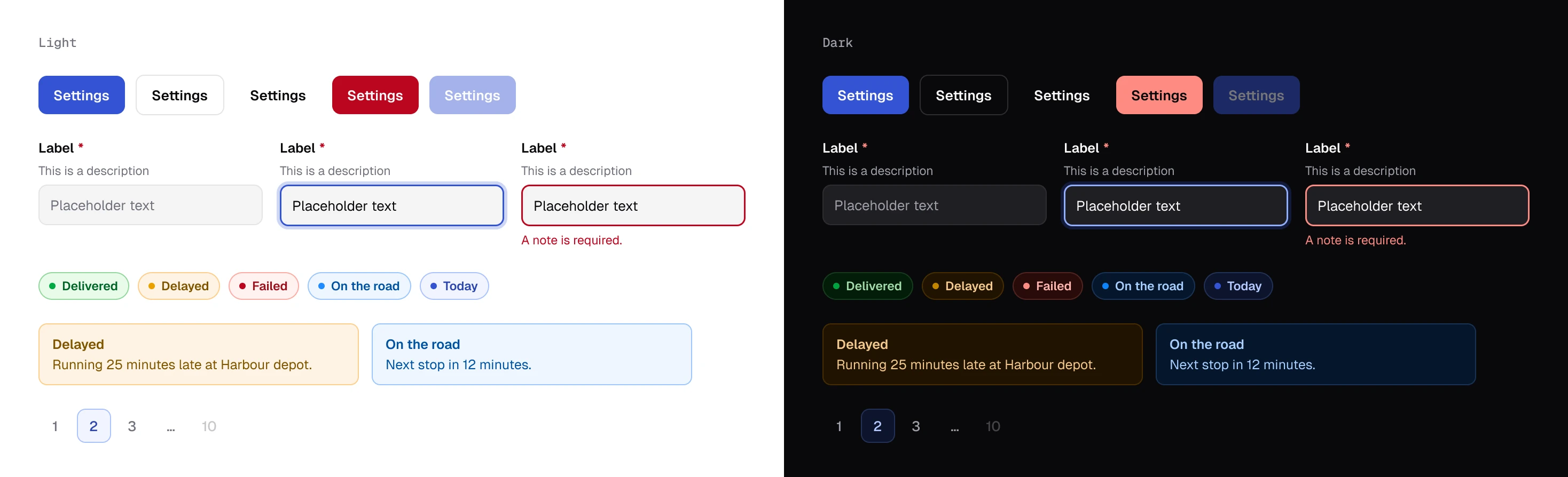
I built the system in Figma first, from the main product's shadcn components: colour variables with Light and Dark modes, and components with their variants and states.
- Button12
- Text input4
- Badge5
- Alert4
- Pagination item3
- role/primary/fill
#3453D3 - role/primary/text
#3453D3 - role/success/text
#00782D - role/warning/text
#7E5400 - role/destructive/text
#BB061E
Colour · Light
Colour · Dark
Radius
Now it lives in code
In the end I shipped it as a code package, so teams build with its parts instead of redrawing them from a design file.
With AI coding tools I built one shared tokens file that sets every colour and role. Each product imports it, and its own globals.css overrides only what that product's interface needs.
/* shared package: the foundation */:root { --brand-50: oklch(0.97 0.014 268); --brand-200: oklch(0.82 0.089 268); --brand-600: oklch(0.5 0.2 268); --brand-700: oklch(0.44 0.17 268); /* roles: for components */ --primary: var(--brand-600); --primary-foreground: oklch(0.985 0 0); --ring: var(--brand-200); --success-text: var(--green-600); --warning-text: var(--amber-700);} .dark { /* text steps re-tuned, not inverted */ --brand-600: oklch(0.76 0.122 268); --primary: oklch(0.5 0.2 268);}Part 3: Accessibility that holds in any colours
Roles, not colours · One lightness per step · Dark mode · Customer colours · Try it · Outcome
Components ask for a role, not a colour
Every hue has five steps, each with one job: surfaces, borders, charts and icons, text on white, and text on a tint. Components ask for success or warning, never a hue and a step, so a hue can change without touching a component.
The same lightness on every hue
I set the steps in OKLCH, where lightness is a number of its own, close to how bright a colour looks. The text steps sit within a few hundredths of each other on all six hues, so a role stays readable whichever hue it uses.
oklch(0.50 0.20 268)Brand text on white 6.3:1oklch(0.50 0.145 148)Green text on white 5.6:1- 30/30text pairings pass WCAG AA
- 5.16:1lowest: amber text on white
- 2modes: light and dark
Dark mode designed step by step
In dark mode I lowered the borders' chroma so they don't glow, and lightened the text steps to hold their contrast.
Tinted surfaces turn deep, so text on a tint still sits on something darker than itself.
Readable with any customer's colour
If customers can pick any colour, a pale yellow, say, can easily put white text on its button at 1.07:1, and navy text on the dark background reads at 2.99:1.
I applied the scales' own rule to the customer's colour. The fill stays theirs, and text on it turns dark or light. Used as text, their colour keeps its hue and moves in lightness until it reaches 4.5:1.
Try it: the system, rebuilt with invented data
The real products are confidential, so this is a rebuild. Switch the brand, the light and dark modes and the contrast labels.
Today's runs
- Run 4821DeliveredAa6.81:1✓14 stops · North depot
- Run 4822Delayed9 stops · Harbour depot
- Run 4823On the road11 stops · North depot
- Run 4824Failed3 stops · Harbour depot
Run 4822
Two stops are behind schedule.Aa4.83:1✓
Outcome
I designed the system in Figma on my own and shipped it as code for different teams to use.
- Consistency
- Three products built from one set of role definitions, base colours and components, each keeping its own character.
- Delivery
- Teams build new screens from shared code instead of redrawing them.
- Accessibility
- Every role passes AA in light and dark, under any customer's brand.