Chongbo NingDesign Engineer, London

Nike China

Nike Athletes Closet

Style stories from fashion influencers, designed to be read, shopped and returned to.

Role
UI Designer
Outcome
Launched across China as a section of the Nike App's home screen. On the strength of the first season, Nike renewed the agency's contract for the seasons that followed.

What this shows

  • Brand storytelling
  • Motion and microinteractions
  • Design systems
0:00 / 0:50

Screen recording

Full quality on YouTube (opens in a new tab)

Read

Shop

Return

Read

Creative system · Visual style · Retouching · Several views of one outfit · Reusable components

01.1

Redesigning the creative system first

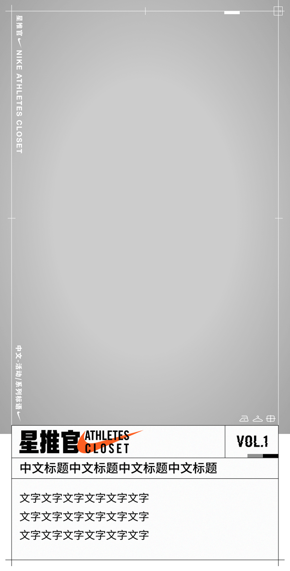
Three volumes had shipped when I took over at VOL.4. The redesign covered the logo lock-up, typography, colour, framing devices and motion.

The framing device balances consistency with flexibility: it adds, removes or rearranges details to fit each headline.

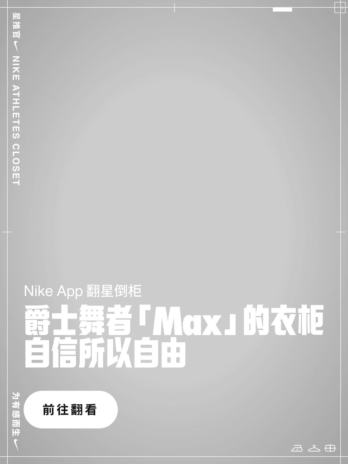
Layout/Framing/Logo-Lockup
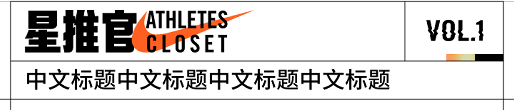
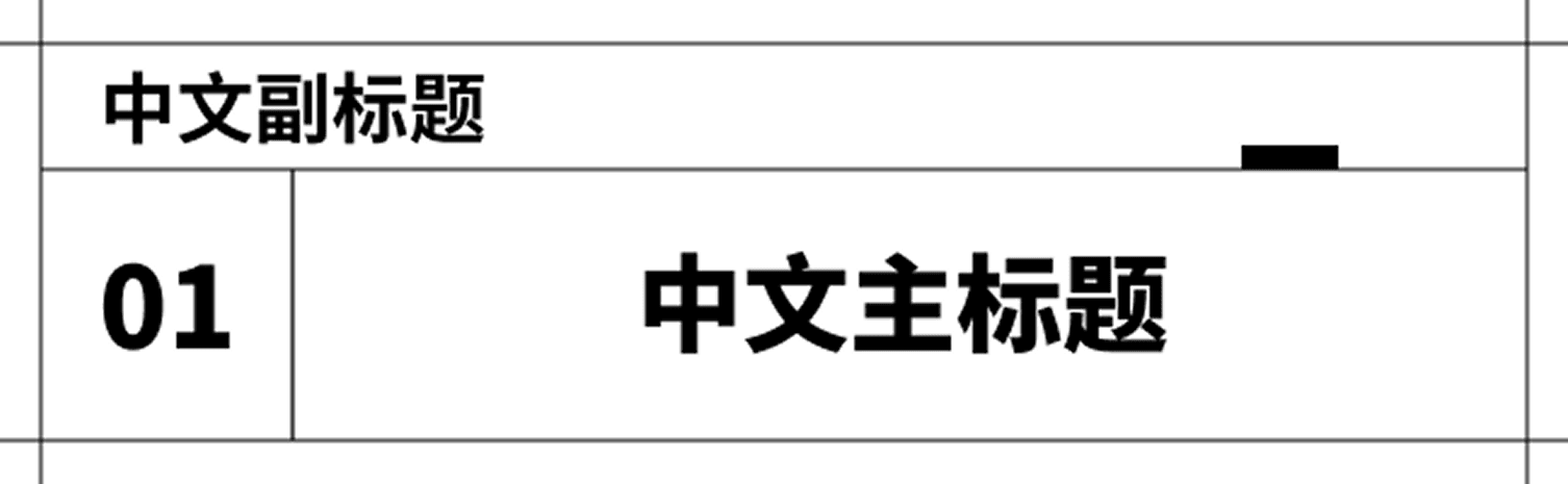
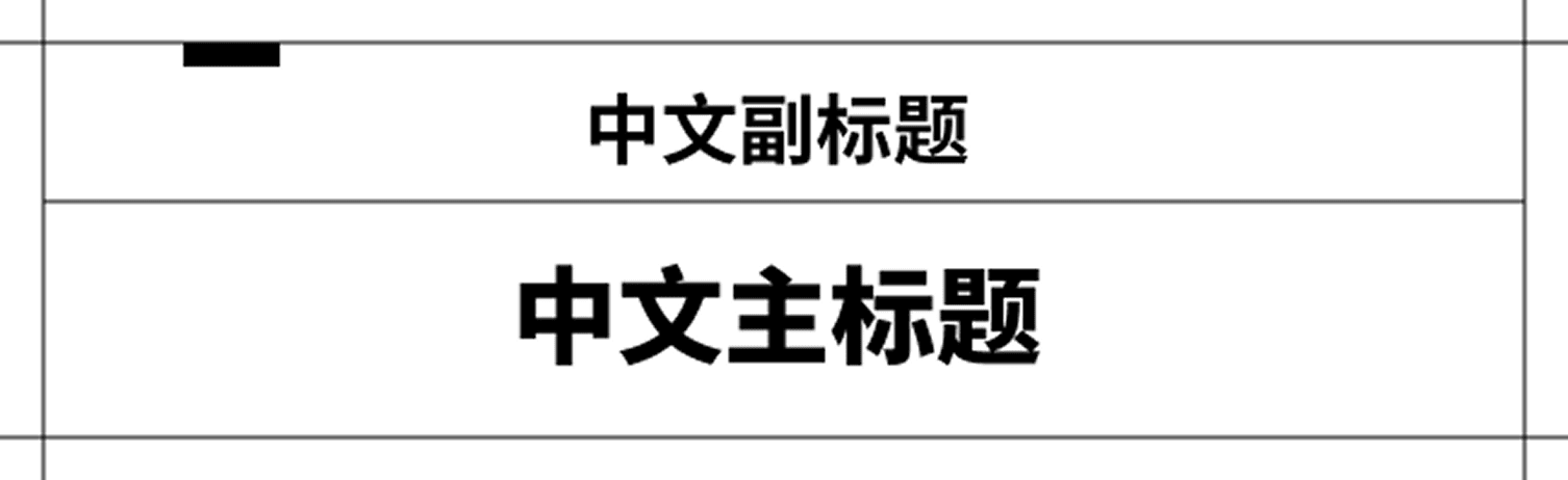
Logo lock-up: the 星推官 Athletes Closet lock-up, VOL number and headline.

01.2

A unified visual style

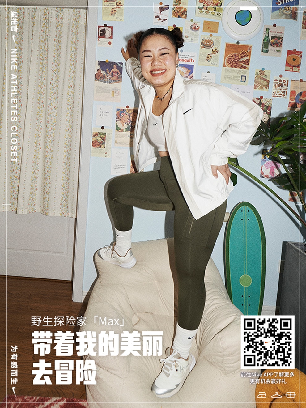
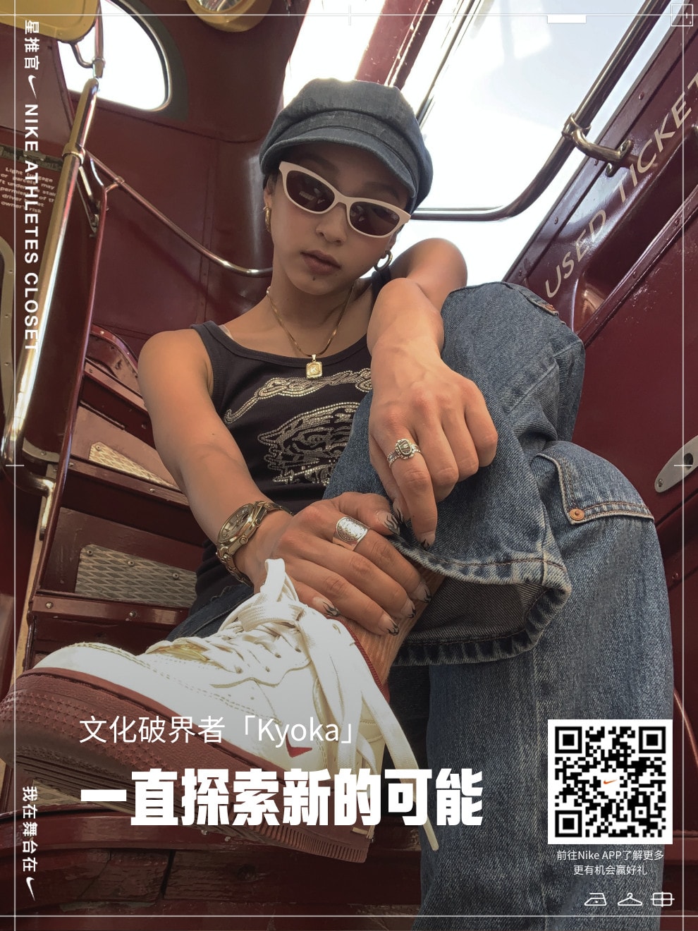
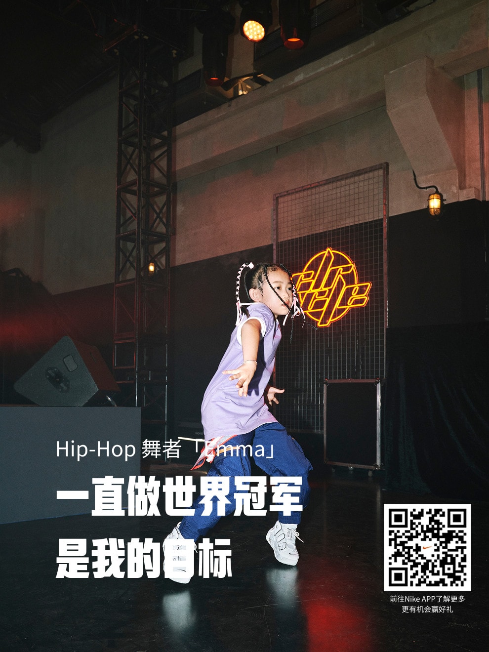
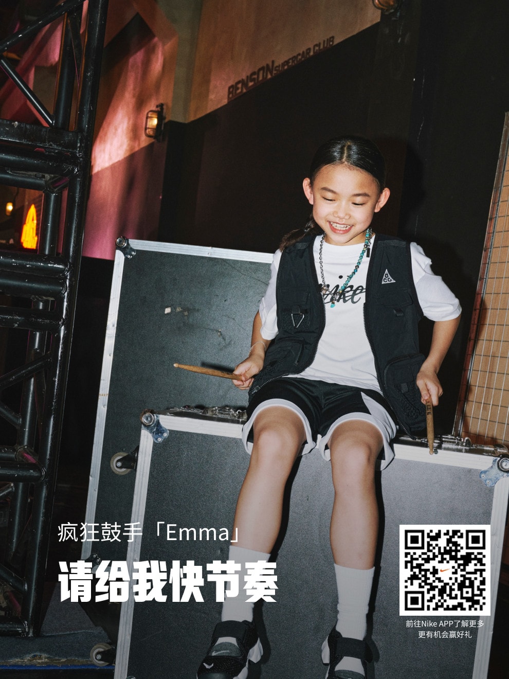
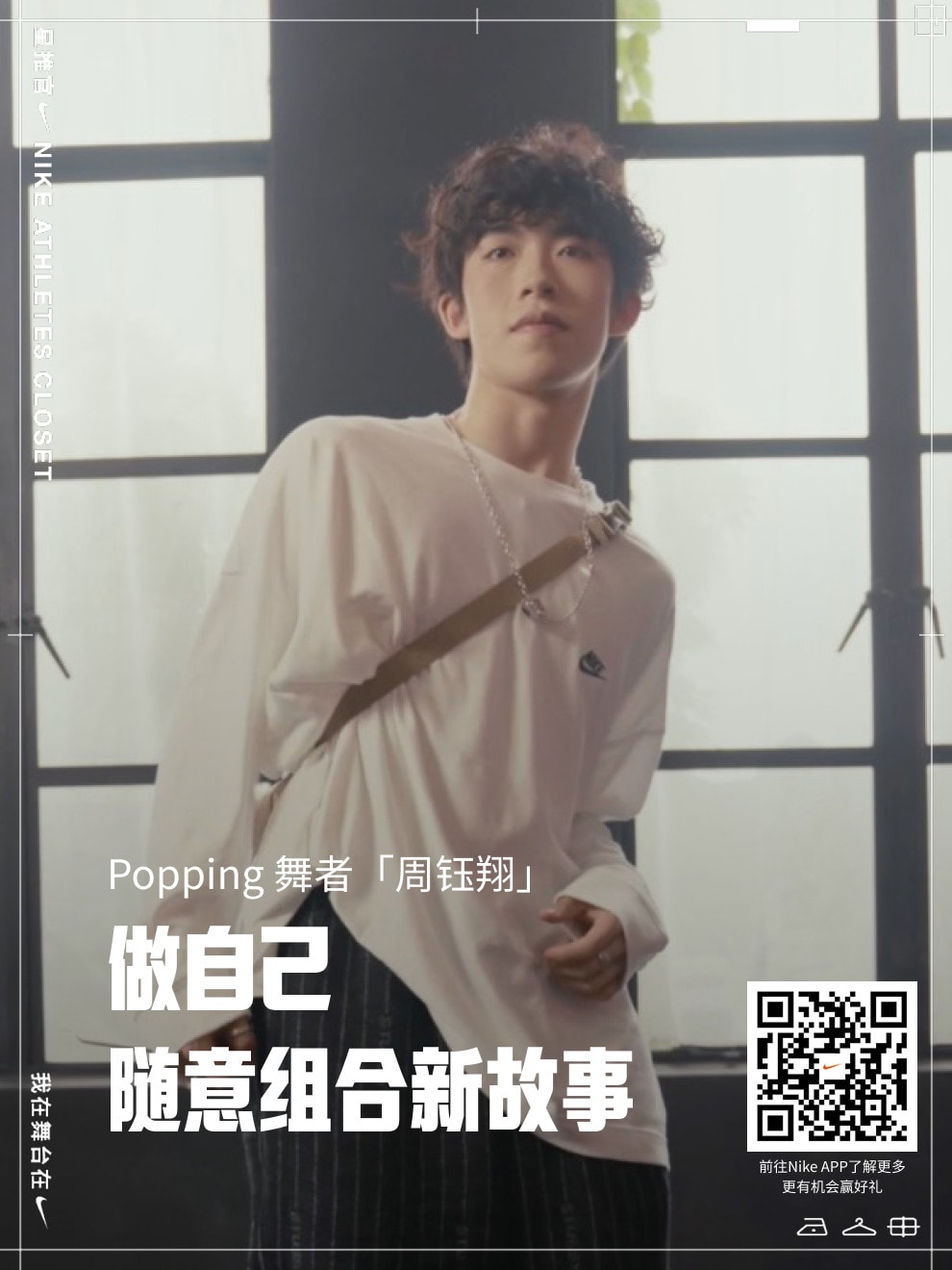
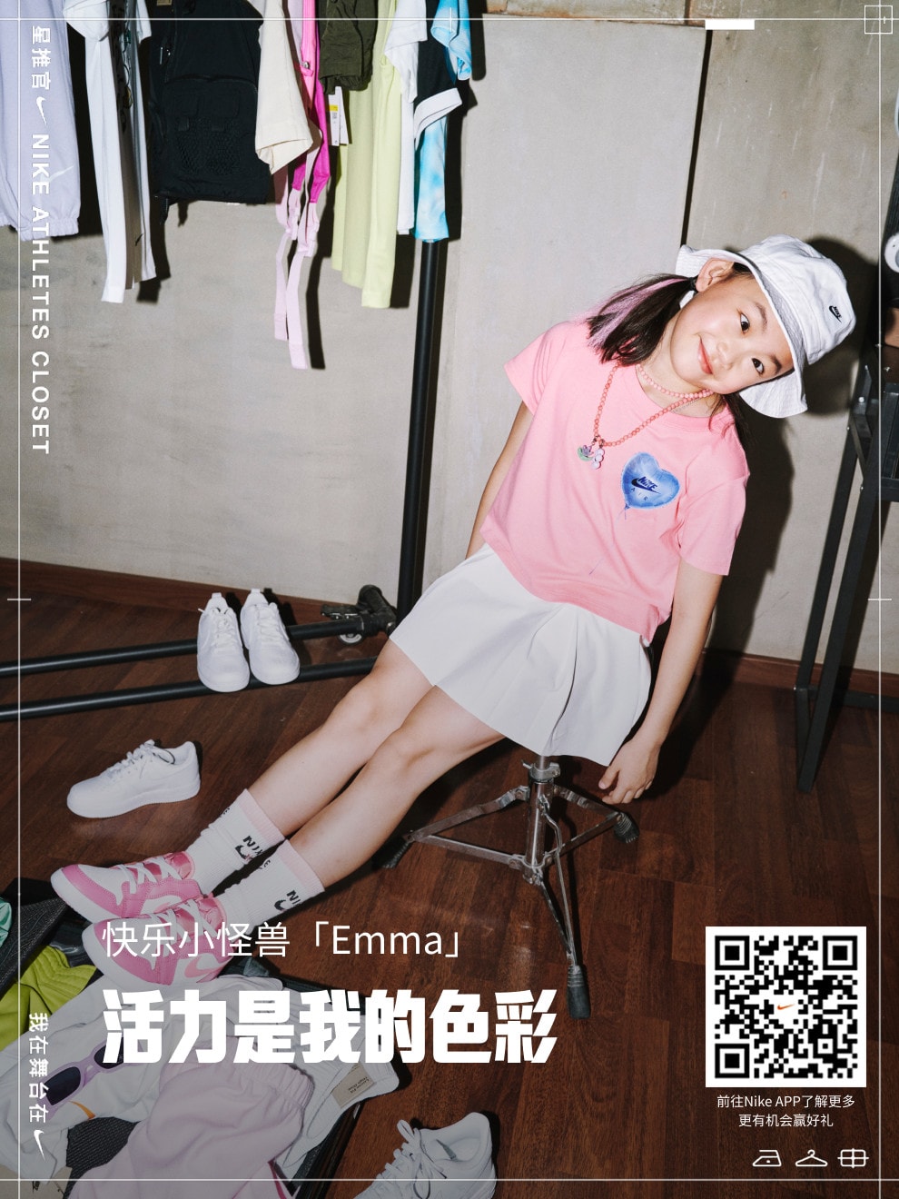
Each influencer gets a hero visual and a poster card in one shared style, which still highlights their own character.

  • Poster card 1 of 6: Max, a wild explorer, standing on a sofa in her room.
  • Poster card 2 of 6: Kyoka, a culture crosser, in sunglasses and a cap.
  • Poster card 3 of 6: Emma, a hip-hop dancer, mid-move under a neon sign.
  • Poster card 4 of 6: Emma, a drummer, on a flight case with drumsticks.
  • Poster card 5 of 6: Zhou Yuxiang, a popping dancer, by a window.
  • Poster card 6 of 6: Emma, a happy little monster, in a pink T-shirt.

01.3

Retouched to one tone

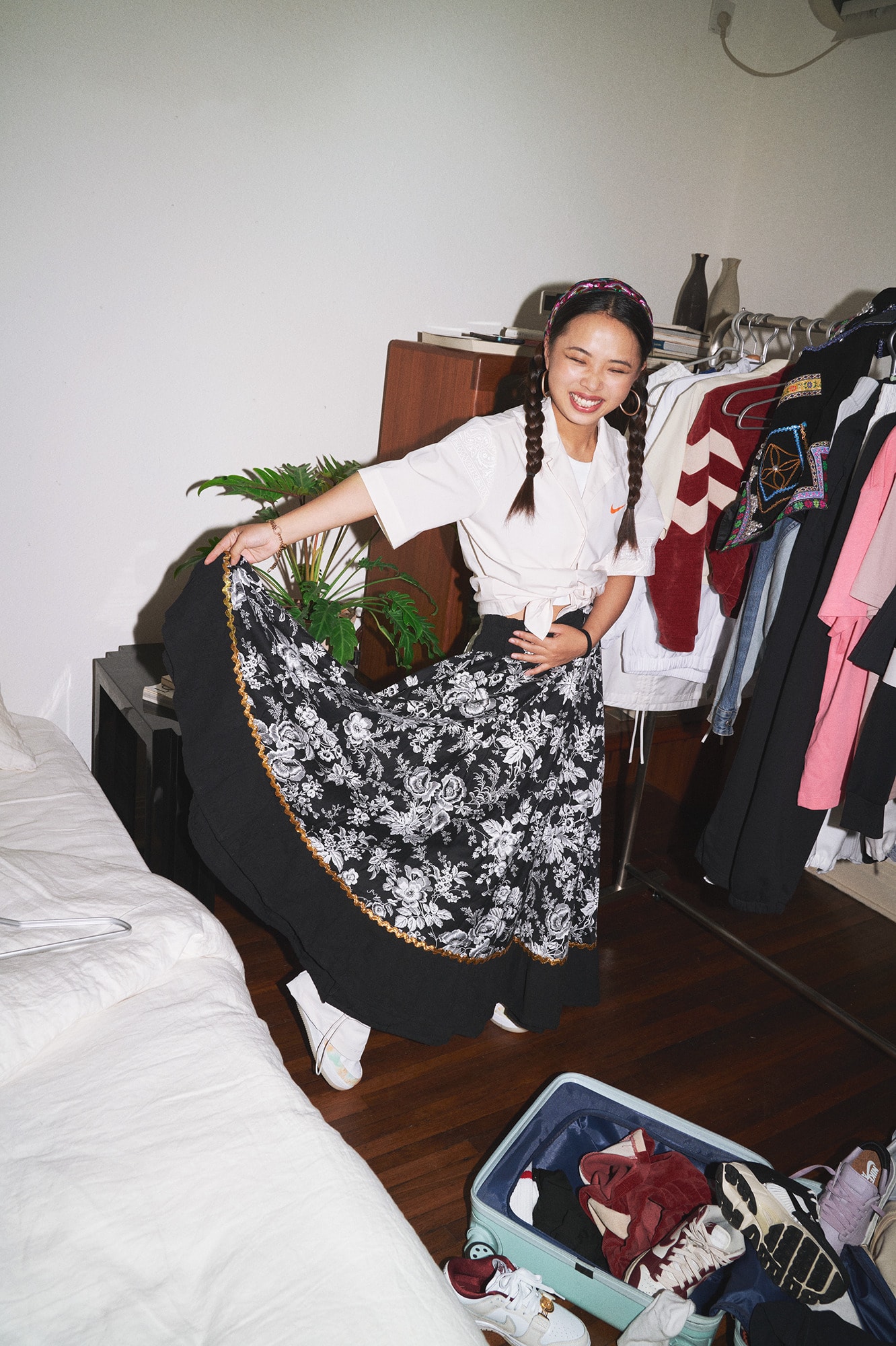
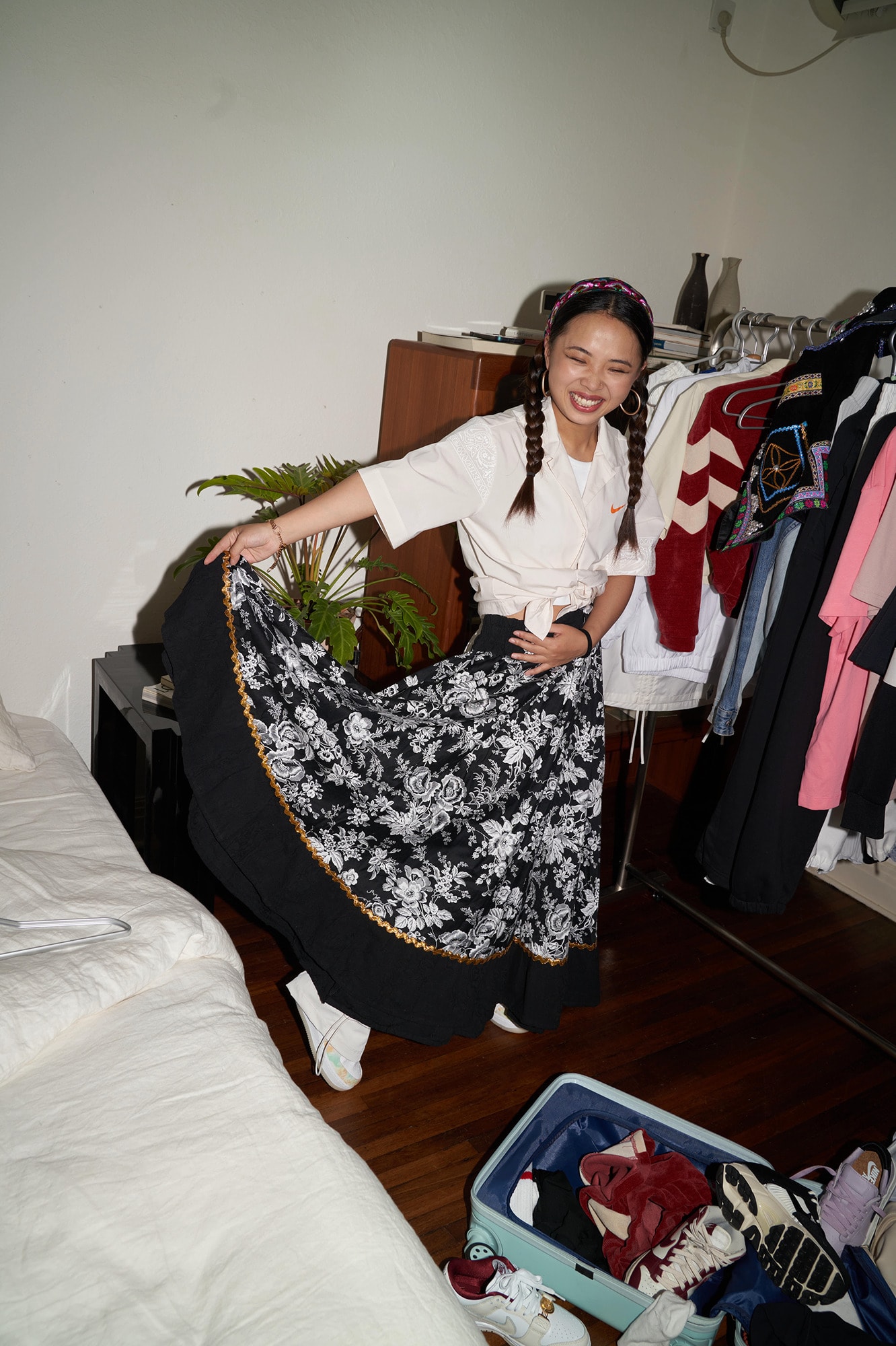
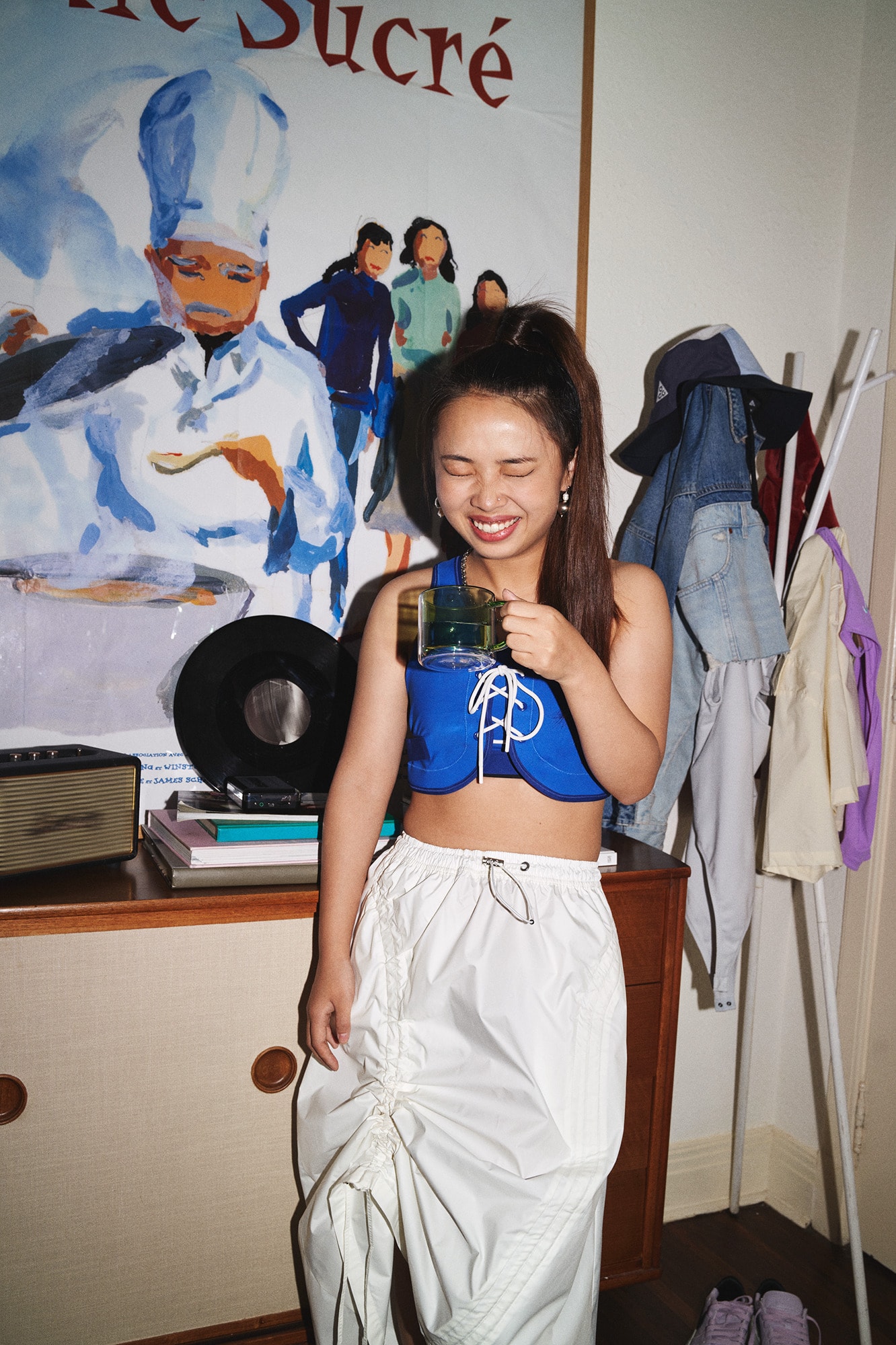
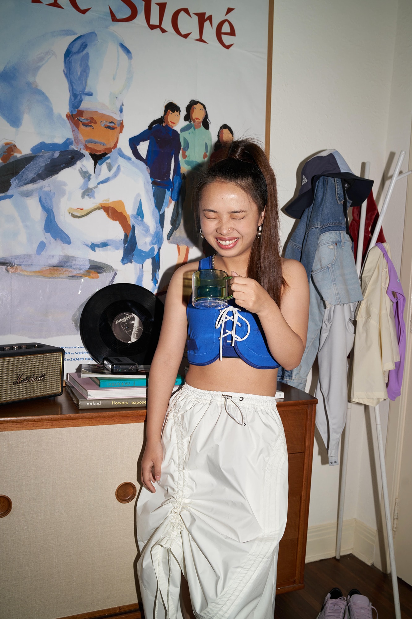
To unify the visual tone and highlight the character of each featured influencer, I retouched key campaign images with tone correction, blemish removal, and flash-shooting vibe enhancement. These treatments aligned the visuals with Nike's core brand values of authenticity, energy, and youthfulness.

Photo 1, retouched with a flash-photography look.
Photo 1, the original before retouching.
Photo 2, retouched with a flash-photography look.
Photo 2, the original before retouching.

01.4

Several views of one outfit, swiped sideways

Before, every angle stacked into one long scroll. As pages, the views take less space, and the next one showing at the edge tells readers there's more.

BeforeAfter

01.5

Reusable components, built for handover

The earlier designs had no standardised component system, so sizes were inconsistent and Nike's engineers had extra work. I audited every UI element, unified sizes, spacing and naming, then rebuilt the interfaces in Figma with Auto Layout and reusable components. It reduced the back-and-forth between design and development.

Layout component: imagery, primary.
Layout/Imagery/Primary
Layout component: imagery, secondary.
Layout/Imagery/Secondary
Layout component: imagery, tertiary.
Layout/Imagery/Tertiary
Layout component: poster-card.
Layout/Poster-Card

Shop

Product tags · Product cards · Star Ranking

02.1

Shop the look, straight from the photo

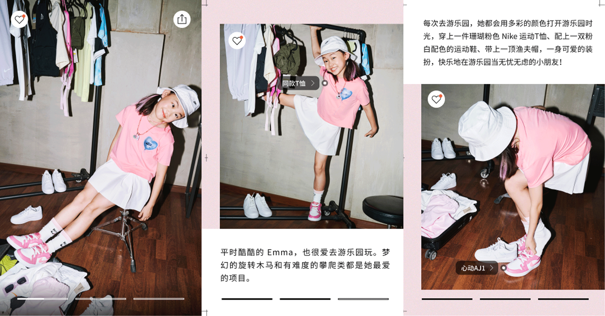
Readers engaged with the stories, but product click-through stayed low, because the stories didn't connect to the products. I added tappable product tags to the photos, so readers go from an outfit to its products in one tap.

Final: three story pages, with product tags on the photos naming a T-shirt and a pair of trainers.

02.2

Products as part of the story

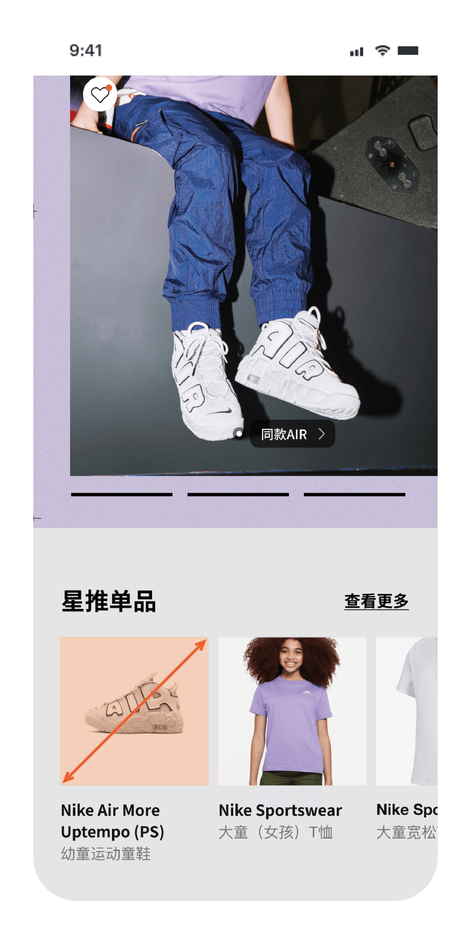
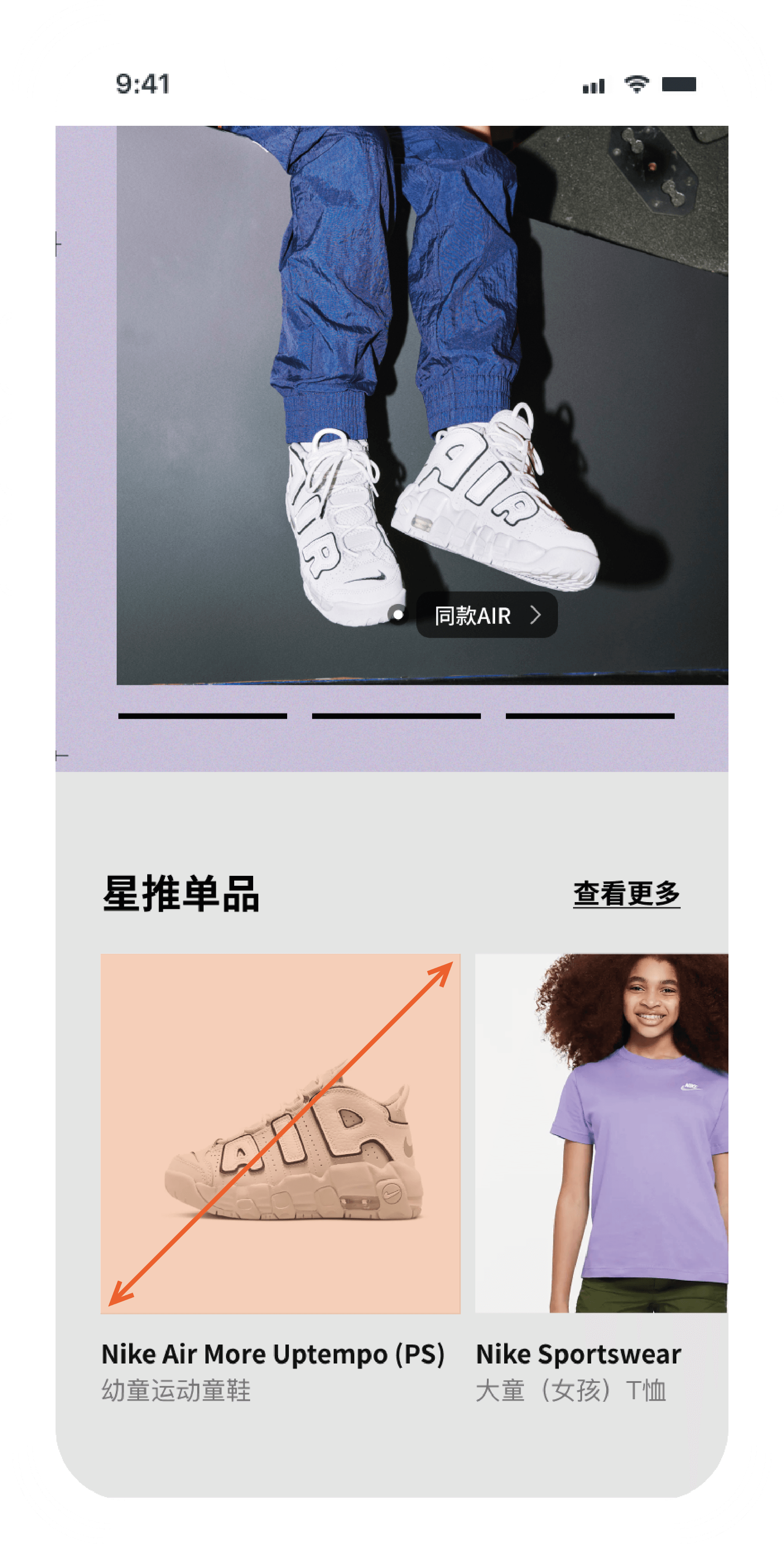
I redesigned the product card layout by enlarging product visuals to increase visibility and emphasise their role in the content flow, making items more noticeable and click-worthy.

Before the redesign: products in small tiles under the story photo.
Before
After the redesign: larger product images under the story photo.
After

02.3

A ranking that leads to similar outfits

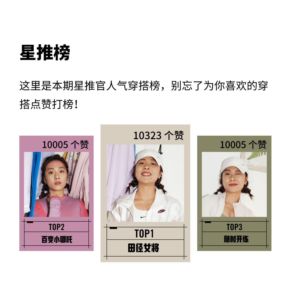
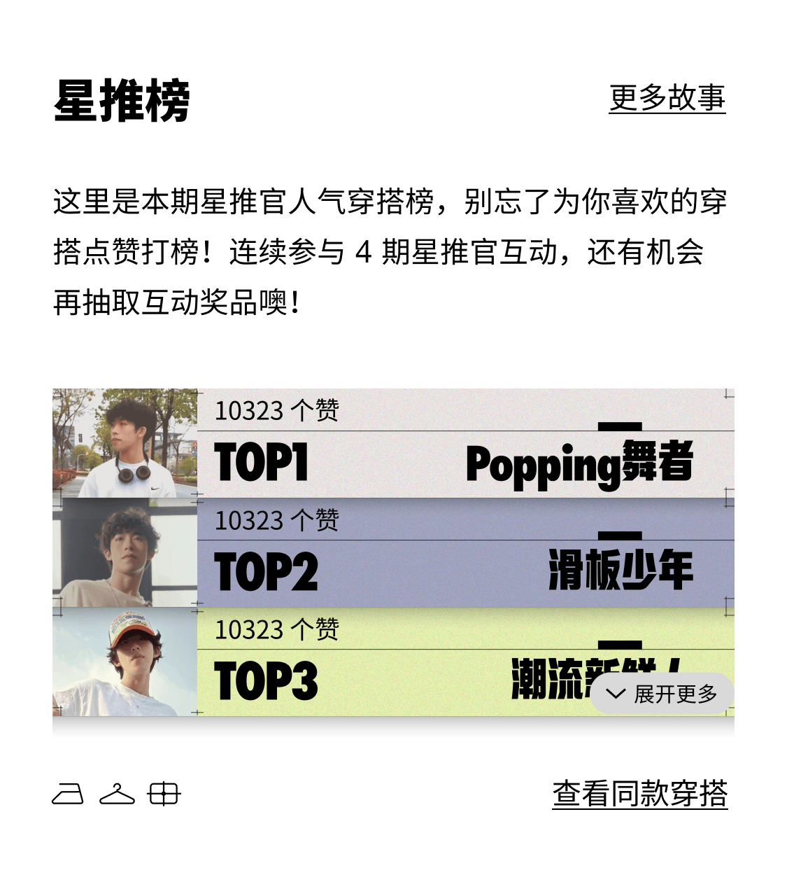
The Star Ranking was a loose, inconsistent list. I rebuilt it as a leaderboard with a clear hierarchy, and added two calls to action after a like: "See more" and "View similar outfits".

Before: three loose tiles.
Before
After: a ranked top three with calls to action.
After

Return

Reward for a like · Star Voice Q&A

03.1

A reward for every like

The stories relied on static text and images, so readers stayed passive and nothing drew them back to the section. I designed a surprise prize draw triggered by a like, with a gift-box animation to reward the action.

03.2

Star Voice Q&A

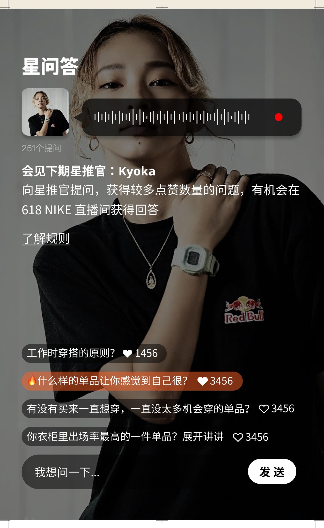
To maintain interest between volumes and build anticipation for the next influencer, I designed Star Voice Q&A: a loop of preview, participation and live response. It shipped, and was recommended for wider use in other campaigns.

Star Voice Q&A in the app: the next influencer's voice teaser, questions with their like counts, and a field to ask one.
  • Voice teaserThe next influencer previews their topic in a short voice clip, with an animated waveform to catch attention.
  • Livestream revealThe top-voted questions are answered live in Nike's livestream.
  • Vote with likesReaders upvote each other's questions.
  • Ask a questionReaders submit questions, shown in an interactive feed.

Outcome

Results

04.1

Design that helped win Nike's next seasons

  • Delivery

    One component system made each volume faster to deliver, and Nike's engineers were more satisfied with the handover.

  • Conversion

    Product visibility significantly improved, with a clearer click-through path and positive feedback from the client on increased user interest and conversions.

  • Engagement

    The layered interaction mechanisms significantly boosted user engagement across the board – from liking to question submission to livestream participation, completing a full engagement loop. The client reported higher-than-expected interaction performance.